June 11, 2005
2nd International Architecture Biennale
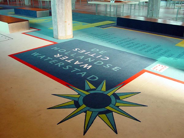
Graphic design with Minke Themans of the exhibitions 'Water Cities' and 'Mare Nostrum' in Las Palmas Rotterdam. Both exhibitions are part of the 2nd International Architecture Biennale.

Map of exhibition

Introduction text to the 'Water Cities' exhibition
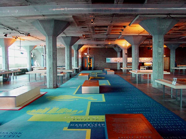
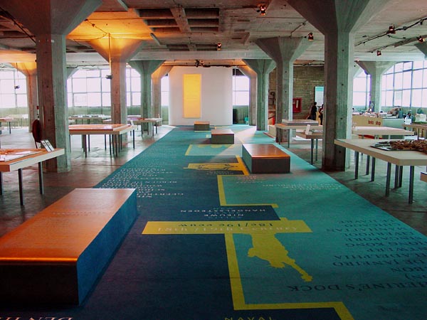
Carpet with information-text modules. The right side of the carpet (dark blue) is the dutch side, the left side (light blue) is the international side. The green center line is the 'land' the continuïty. This system is part of the leading concept for the exhibition design.
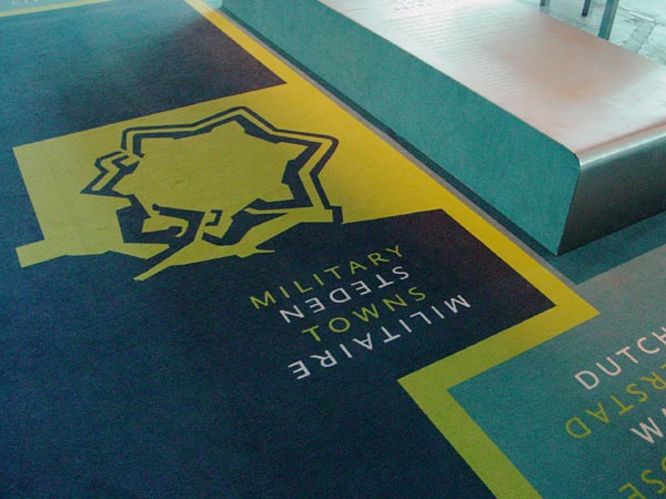
Carpet-detail (map of Willemstad)

Information-text modules; the light blue text is international (english), the dark blue is Dutch. The typography is devloped as a 'wave' form where the first line is the largest and slowly decreases per line.

Carpet-detail

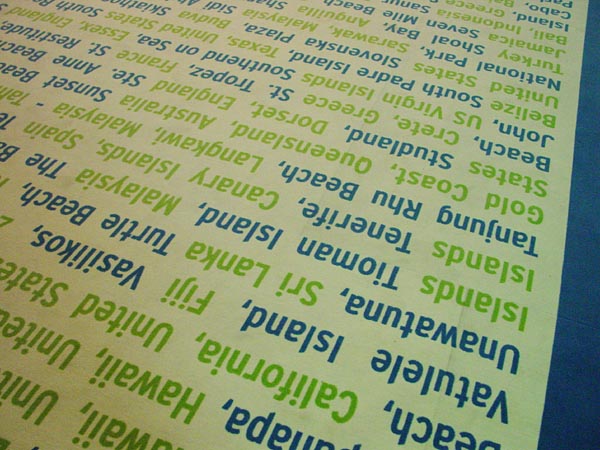
Carpet-detail, second exhibition 'Mare Nostrum'. A list of all top-beaches is the basis of this part of the carpet design. With the over-all suggestion of a beach.

Datascape Mare Nostrum, 24 perspectives on the global influence of tourism. Exists of large information wall's with a contrast between pixelated beach pictures from around the world an a infographic layer which sometimes seems t connect to the images and sometimes is disconnected.

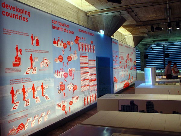


Datascape, detail

Continuing the second part of the 'Dutch Watercities' exhibition.

Carpet-detail

Model with 'information-cards'

Model with text


Routing is a formal part of the carpet

